
In a nutshell:
- Landing pages often determine whether clicks turn into leads—and this is exactly where most SME projects fail due to too many elements, unclear CTAs, and generic text.
- We’ll show you which elements really make a landing page convert and which ones should be cut immediately.
First impressions are the most important. And a landing page is often the first page your website visitors land on. From there, they decide whether to stay on the page, learn more about your business, make a call or a purchase, or leave the site. That’s why it’s important to design a landing page that captivates and engages visitors. In this article, we’ll give you tips for the perfect landing page structure.
What is a landing page?
A landing page is a sales page or page where people land after clicking on an ad in search engines—for example, in the top section of search results dedicated to sponsored content. Banners, social media, and other ads can also direct visitors to a landing page. Landing pages are often designed to convert visitors into customers, sign up readers for a newsletter, or encourage them to fill out a survey.
As mentioned earlier, landing pages are the first impression visitors get of your website. From there, they decide whether to stay on the page or leave it. So spend plenty of time building the perfect landing page.
Why is a landing page important?
Without a clear, concise landing page, it can be difficult to motivate visitors to learn more about your offering. The optimal structure of a landing page therefore includes key elements that encourage users to get in touch or purchase a product.
These elements should be incorporated into a good landing page:
- Compelling headlines and subheadings
- Compelling copy, especially the introduction
- Professional hero shot
- Offer and services at a glance
- Social proof, testimonials, certifications
- Strong call-to-action (CTA)
Need help creating your landing page?
Why is building a landing page so important?
The goal of a landing page is often a conversion—such as the purchase of a product or service, signing a contract, or a download. To guide visitors toward this goal, the landing page should be structured in a way that influences visitors through its design.
Therefore, there are several factors to consider during the design process, such as copy, buttons, design, images, or video. By optimally coordinating the elements of a landing page, you can increase your conversion rate.
Here’s another interesting fact that’s important for landing page design: In a HubSpot survey, 76% of respondents said that design and interactivity are less important to them than finding what they came to the page for. That’s why it’s important to design your landing page so that users can easily find their way around. Users want to find exactly what they’re looking for on your page.
The Structure of a Landing Page
Creating landing pages isn’t that difficult. The structure of a landing page can be broken down into three parts: header, main body, and footer.
The header presents the most important information at a glance, specifically in the headline and background image. Here, it should be immediately clear to visitors what they can find on the page. The offer should be phrased simply so that all essential information is easily recognizable.
In the main body, you can then elaborate on the topic with more details. This is the place to answer questions and address any concerns or fears upfront.
The footer typically contains contact information and additional links that allow users to continue browsing your website.
Overall, the landing page should have a consistent design and be easy to navigate. An appealing design, structure, and layout, along with professional content, convey an image of high quality.
The most important elements for an optimal landing page structure
Certain elements are essential for a successful landing page. Here, we explain in detail which textual and visual elements and features are essential and how you can optimize your landing page.
In general, good and creative design is important. However, creativity can also backfire and interfere with usability. Perhaps you’ve come across a page with background animations and images that looked nice but actually distracted you from the main reason for your visit. To ensure your landing page remains successful and visitors don’t bounce, you should prioritize usability. This includes, for example, reducing load times.
You should also keep the following elements in mind when creating a landing page.
Compelling Headlines and Subheadings
The headline is arguably the most important element of a landing page, because it’s the first thing users see when they visit your site. This is where it’s decided whether visitors stay or leave.
According to David Ogilvy, the headline is read five times more often than the rest of the text on the page. That’s why it’s important for the headline to present the most important information in a creative and straightforward way. There should be no room for interpretation here. Instead, get straight to the point.
So clearly state what the page is about. This depends on your company, industry, and target audience, but the headline should definitely address the preceding ad or include the search term. After all, visitors are looking for a solution to the problem they entered into the search engine.
Here’s a fun fact: When writing the headline, pay attention to the order of the words. Just like when reading individual words, we tend to notice the beginning and end of the headline more. So, don’t hide important keywords in the middle. This is also known as the primacy effect.
If you’re still unsure what a good headline for your landing page looks like, consider the following questions:
- Who is the target audience?
- What problems does your offer solve?
- What solutions do you offer to your potential customers’ problems?
- Is it immediately clear what the page is about?
It’s best if the text on your landing page revolves around the target audience. That’s because landing pages often focus on the company, when they should actually be addressing the problems and concerns of the users.
Here are a few good examples where you can decide which headline is better.
Headline 1: We’re SEO experts from Stuttgart. Give us a call.
Headline 2: Do you want to increase traffic to your website? We’ll help you attract new customers.
The second headline directly addresses the customer’s problem—low website traffic. It also highlights the specific value of working together: attracting new customers.
The first headline, on the other hand, gives visitors little reason to get in touch, as it focuses on the company rather than on potential customers.
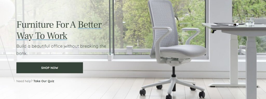
Image: This hero image from Branch Furniture features a creative headline with text that anticipates potential customers’ concerns (spending too much money).
Engaging content and compelling copy
Some landing pages still tend toward clickbait, even though internet users are now well aware of false promises. However, companies today need to do more to earn the trust of your website visitors.
The page’s headline is designed to capture the target audience’s attention. Only then can you incorporate relevant details about the offer into the copy.
Here, too, the focus should be on the visitor rather than the company or the offer. So in your copy, emphasize how your products or services help customers, not how great the offer is.
In your copy, you can also make sure to address potential objections in advance. Every target audience has specific fears or doubts about your offer—for example, that prior knowledge is required or that the setup process for a product takes too long. Anticipating potential objections or concerns helps visitors make a purchasing decision.
The users are always the priority, so you should make it as easy as possible for them. By addressing these concerns directly, you lower the barrier for customers to make a purchase.
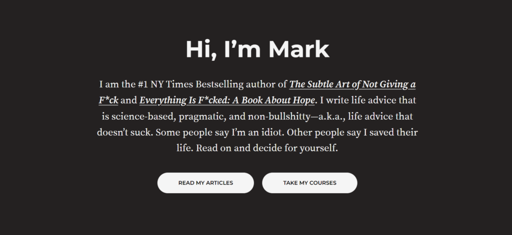
Image: Author Mark Manson uses creative copy on his website to convince customers of his expertise.
Professional Hero Shot
A hero shot demonstrates how a product or service works. The hero shot is located “above the fold,” alongside the headline or slogan, and often features a photo of the product or service.
This element, along with the headline, is the first thing visitors see on the landing page. It’s best to immediately convey to visitors what they can expect from your offer.
A professional hero shot should highlight the unique selling points (USPs), demonstrate the product’s functionality, and foster emotional connection. For example, the background image could show a person from the target audience using the product or expressing satisfaction with the service.
A strong hero shot should captivate visitors and encourage a conversion. The best way to achieve this is by including a button with a call-to-action (CTA) in the hero section. However, the hero shot should always be aligned with the copy—that is, the headline and the CTA.
Instead of an image, a video or a slideshow can also be used as background media in the hero section. However, you should use these with caution so as not to distract from more important elements and deter visitors.
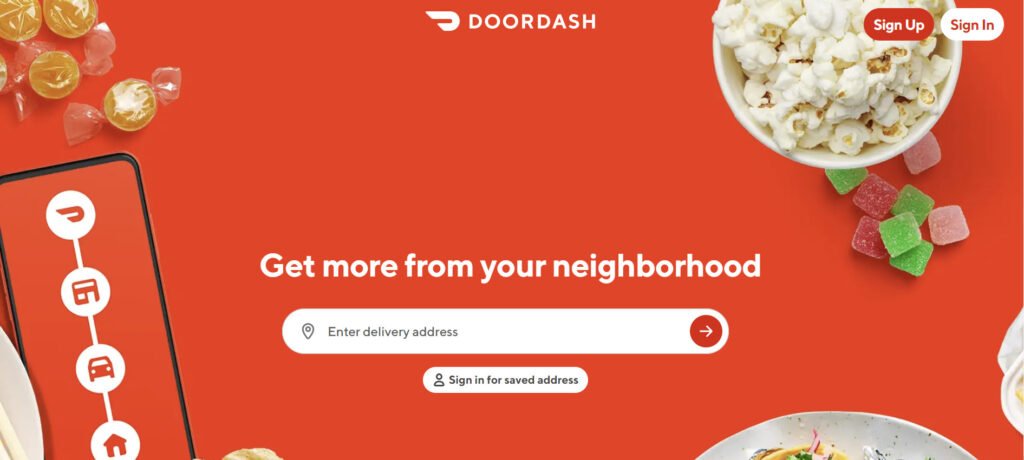
Image: This Doordash landing page features a creative headline and a clean background image that effectively showcases the company’s offerings.
Offer and Services at a Glance
The landing page must clearly convey which products and services you offer. Visitors should know at a glance what your offer is all about. Here, it’s important to avoid room for interpretation, surprises, and secrets.
This works best when the text isn’t too long or too short. After all, you don’t want to overwhelm your visitors with details, but you also don’t want to withhold important information.
The following questions can help you decide which details to include and which to omit:
- Why should your target audience be interested in your offering?
- Why should customers choose your offer?
- How do visitors benefit from your offer?
- How does your offer help other people?
The better you can communicate the benefits of your products and services, the more conversions you can achieve. However, you shouldn’t confuse benefits with features here.
Features are characteristics of the product, such as the high water column of a rain jacket. The benefit of a highly waterproof rain jacket, however, is that users stay dry even in heavy rain.
To identify the benefits, ask yourself why a product feature is useful to customers.
But how can benefits be communicated clearly? One option is lists, icons, or a combination of both.
Social proof, testimonials, certifications
Smaller, lesser-known brands, in particular, must go the extra mile to build trust. Often, visitors to the landing page are not yet familiar with the brand and are skeptical. That’s why it’s all the more important to convey to them that they’ve come to the right place with your company.
Various elements are important for building trust. First, the logo should be placed where it’s clearly visible. The top left corner is the best spot for this. But an open presentation of your team also builds trust, as it shows that there are real people behind your services.
Social Proof
Recommendations are particularly important in online marketing. The concept of “social proof” holds that when other users have had positive experiences with a product or service, other potential customers assume they will have good experiences as well.
How you use social proof on your landing page depends on your target audience. For some customers, it’s important that many people like your products. For others, it’s important that influencers or well-known figures approve of your offering.
Nevertheless, plenty of positive feedback is beneficial. So collect reviews and ratings as well as likes and comments on social media. You can then use these on your landing page for promotional purposes.
You can also gain your visitors’ trust through customer reviews, certifications, and awards. By displaying these on your landing page, you convince your potential customers that your offer delivers on its promises.
Testimonials
With review elements such as testimonials, you can show visitors that other customers find your offer useful. These testimonials should, of course, sound authentic. This works best when customers clearly express the benefits they find in your offer. Only positive statements and praise can quickly come across as inauthentic. Alternatively, you can also incorporate star ratings or reviews on the landing page.
Certificates
You can also build trust with the help of certifications or seals. These demonstrate your expertise, years of experience, or high quality.
Depending on the industry, these seals naturally look different, but it’s important that they are recognizable to your target audience. They should therefore be issued by reputable and professional institutions. This is the only way to prove that your offering is a high-quality service.
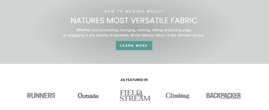
Image: WoolX, a manufacturer of merino clothing, uses features in well-known magazines to build trust.
Strong Call-to-Action (CTA)
The term “call-to-action” has come up frequently in this article. The CTA is often referred to as a conversion element, as its purpose is to motivate visitors to make a purchase or get in touch. The CTA is therefore a specific prompt to take action and a crucial element in designing a landing page.
Examples of CTAs include “Contact us now,” “Buy our e-book now,” or “Give us a call.” CTAs should be specific and friendly so that the target audience is more likely to follow through.
It’s important that a landing page have only one CTA, not several. If there are too many different calls to action, visitors might leave the page out of uncertainty.
Strong CTAs answer two questions: “What should I do?” and “Why? What’s in it for me?”
Here’s an example of a good CTA: Contact us now and boost your conversion rate.
The design of the CTA is also important. Make sure the button or link is clearly visible and invites users to click on it.
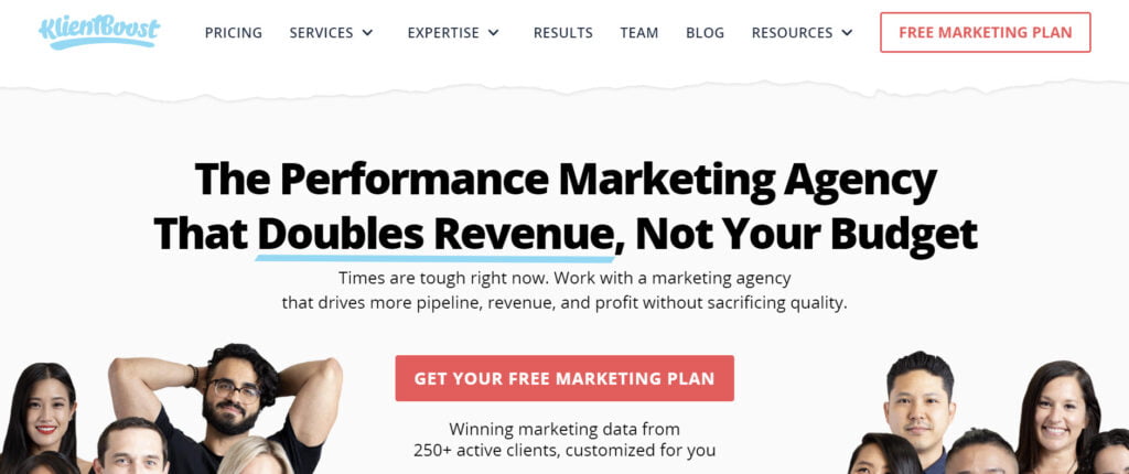
Image: Klient Boost entices visitors with a free marketing plan.
Landing Pages for Lead Generation
A landing page has another advantage. It’s also useful for lead generation. To do this, a form—such as a newsletter sign-up form—is added, where visitors can enter their personal information. Another option is to offer an e-book in exchange for contact details like email addresses.
Collecting personal data from prospective customers is referred to as lead generation. With the information collected, companies can send advertisements and newsletters to their prospects. However, you should ensure that the content sent offers concrete added value.
Leads can also be generated the other way around, by providing your company’s contact information. Your phone number and email address should always be displayed on the landing page. This way, your target audience knows how to reach you if they have questions. Social media links should also be included on the landing page.
To summarize: Conclusion
You can use this checklist to create the perfect landing page structure.
- Formulate the headline clearly and concisely so that the target audience immediately understands what your page is about.
- The image in the hero shot must match the headline and support the offer. Inauthentic images have no place here.
- Clearly communicate the benefits of your products/services, not just the features.
- Build trust through social proof, testimonials, and certifications so your target audience can see how your offer has made other customers happy.
- Anticipate and address potential objections from your target audience by dispelling their concerns.
- The CTA should have only one goal and should be placed at the beginning or end of the landing page.
Conclusion: How a well-structured landing page increases traffic and conversions
The perfect landing page structure includes various individual elements but doesn’t overwhelm visitors. If you’re clear about the goals you’re pursuing with the landing page, it’s easier to convert visitors into customers. A good landing page has a major impact on traffic to your website and leads to higher sales.