
TL;DR
- Web usability is no minor detail: poor navigation and slow loading times drive customers away.
- Unclear CTAs cost you conversions from existing visitors every day.
- We’ll show you how to critically evaluate user-friendliness.
- Benefits: Quick fixes with maximum impact on conversions and improved Google rankings.
In a nutshell:
- Web usability isn’t just a cosmetic detail—confusing navigation, slow load times, and unclear CTAs lose customers every day who were already on your site.
- We’ll show you how to critically evaluate your website for user-friendliness and which quick fixes have the greatest impact on conversion rates.
Websites are a dime a dozen, and unfortunately, many are poorly designed, leaving users unable to navigate them. The result: No purchase of the offered product takes place. That’s why it’s important for your website to have good web usability. Because that’s exactly what makes it user-friendly and drives sales. We’ll tell you what to keep in mind here.
What Is Web Usability? – A Definition
Web usability refers to the user-friendliness of a website. After all, nothing is more frustrating for users than when content is hard to access, buttons won’t respond, or links lead nowhere. Furthermore, the design and visual appeal are also relevant to the website’s user-friendliness. As you can see, there are quite a few different components.
Optimizing a website’s usability is therefore a key discipline in online marketing. This is also because web usability <adata-wpil href="https://waterproof-web-wizard.de/blog/google-ads-optimierung-tipps/" class="lnk">is a significant <adata-wpil href="https://waterproof-web-wizard.de/blog/google-ads-optimierung-tipps/" class="lnk">Google ranking factor. So, if you want to keep users happy and ultimately <a href="https://waterproof-web-wizard.de/blog/online-marketing-fuer-anfaenger/" class="lnk">win customers</a>, you should continuously improve the usability of your website. </adata-wpil></adata-wpil>
What options are available for testing web usability?
To make improvements to usability, you first need to know what is currently bothering users. So-called usability tests show how internet users navigate your website and where they get stuck, have to take detours, and consequently leave the site. The degree of usability is determined based on this information.
The simplest method is the “System Usability Scale,” or SUS for short. This is a system for evaluating user-friendliness developed by John Brooke in 1986. Users are given a questionnaire with ten questions and a response scale from 1 to 5.
This questionnaire provides an initial indication and a general trend regarding overall user satisfaction. If you want more detailed information, you’ll need additional analysis methods. This is because the SUS cannot provide precise insights into weaknesses or ways to improve usability.
Options include user observation, live testing, eye tracking, heuristic evaluation, etc. With the help of these tests, you will then also obtain significant and valuable results.
The most important aspects of good web usability
First things first: Good web usability isn’t subjective or a matter of personal taste; it follows certain standards. This naturally makes it easier for you to improve web usability. But do you really have to go through all this trouble and put in so much effort? Well, whether you like to hear it or not: You don’t need the users.
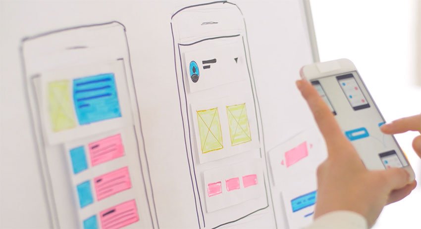
Your nearest competitor is just a click away. Users will leave long before you even notice. Improving user-friendliness is therefore a must, not just a “nice-to-have.” Below, we’ll share the most important standards with you:
Clarity
Offers, blog, About Me page, homepage. This content must be clearly worded to keep customers engaged. On average, we have just five seconds to convince new users of our website.
No one clicks through a confusing website. That’s why the customer must be able to answer the question “What’s this actually about?” for themselves in just a few seconds. Even complex products or services need a simple explanation. The homepage is particularly important here, as it serves as a point of reference for the user.
Tip: You can also convey the purpose of your website through a slogan or an explanatory logo. Alternatively, you can prominently highlight your USP (Unique Selling Proposition) on the homepage.
Orientation and Structure
In addition to website identity, your website also needs simple navigation and structure for optimal orientation. You can first check whether all buttons, links, icons, and navigation elements are self-explanatory and clickable. The menu bar also needs a manageable number of menu items and clear labeling.
It’s advantageous to use classic navigation icons that users are already familiar with from offline shopping. Two examples are the shopping cart, which symbolizes a purchase, and the magnifying glass, which allows users to search for something. For a brand, the logo should also be linked and always lead back to the homepage.
Consistency
When it comes to consistency, the focus is on the visual design and the content. By visual design, we mean that the website has a uniform formatting of the logo, buttons, and other graphic elements on the page. This creates consistency. The same applies to the wording used on the website. It should be consistent.
For example, using different words that are synonyms can confuse customers. If you refer to something as an “order” on the homepage and later call it a “purchase,” this can be confusing. Some companies therefore create so-called “content style guides” to help ensure the correct wording is used.
Attractiveness
A website should be designed to be attractive, encouraging users to browse the site. This is similar to a department store. You should therefore ensure that your website has a clear visual hierarchy.
Whether it’s graphics, subheadings, or images, all of these should be designed so that meaning and context are clear. Important elements should take up more space on the website, and unimportant ones less. Additionally, clickable elements must always be recognizable. Words that are links should therefore be highlighted in color and underlined.
When it comes to a website’s color scheme, images, and graphics, calm and order are preferable to gimmicks and animations. This is because a pleasant color scheme keeps the user on the website. In contrast, garish colors, flashing elements, and other distractions tend to drive users away.
3 Web Usability Mistakes
Here, we’ll reveal the most common usability mistakes we encounter every day when reviewing websites, so you can do better:
- Unrecognizable interactive elements
A major mistake occurs when interactive elements and links are not visible. Unfortunately, web designers often overlook the fact that the hover effect does not appear on mobile devices. You should pay attention to this, as mobile devices are becoming increasingly important. Since 2019, a full 75 percent of users in Europe have been using “mobile traffic.”
- No search function
Do you have a complex website with many subpages, offers, a blog, and more? Then you need a search bar. This is the only way for users to immediately find what they’re looking for. The search field is best placed prominently in the menu bar. Avoid this easily fixable mistake.
- Cluttered blocks of text
Reading on a laptop or cell phone isn’t easy on the eyes. Plus, we tend to read more casually on a computer. This means users are more likely to skim the pages. However, if there are long blocks of text without paragraphs, the content automatically becomes hard to read. As a result, less of it sticks in the user’s mind.
Checklist for Good Web Usability
There are many factors that are important for a website. To help you keep track of everything, we’ve created a checklist to improve your website’s usability:
- Do users understand what to expect on your website within five seconds?
- Is your navigation intuitive even for inexperienced users?
- Have all elements been selected consistently?
- Is all text easy to read?
- Is your website’s layout responsive, meaning it’s readable on different devices?
- Are there any unnecessary effects that distract users?
- Can you find the most important information at a glance?
- Does the page load quickly?
- Is the website accessible?
- Is the content clearly structured?
Web Usability as the Key to a Successful Website
You now have a comprehensive definition of usability and likely understand why companies cannot afford to neglect this topic. Four questions are central to website development:
- What content is most important to your visitors?
- What are your website visitors looking for?
- What information does every visitor need?
- What information is important only to some visitors?
If these questions cannot be clearly answered, a high bounce rate is certain.
Admins measure this bounce rate as a short time spent on the website, and this is also reflected in the conversion rate.
However, once you’ve identified the weak points that need to be addressed through testing and adjusted the website accordingly, you should have a well-designed site that makes it easier for users to navigate and take advantage of your offerings. This should also boost the company’s revenue and help the website generate more conversions.
Conclusion: Web Usability with Waterproof Web Wizard
We’d be happy to help you improve your web usability. Would you like to schedule a no-obligation introductory meeting? You can reach us by phone at +49 751 95899217 or contact us via our contact form. We look forward to hearing from you.